
2021, 2024
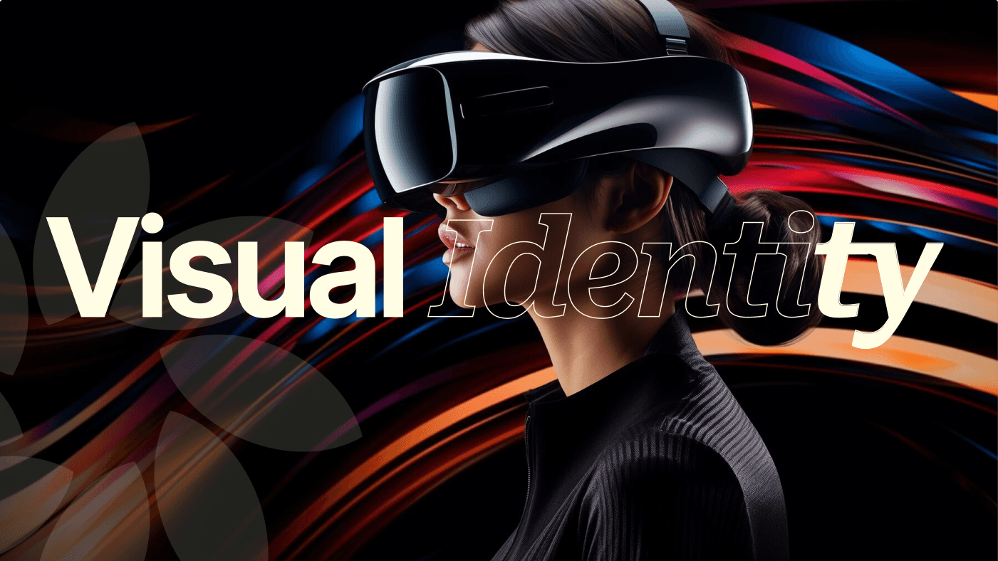
EMB Brand Identity Revamp
This project traces the journey of our brand from ExMyB, a name people struggled to pronounce, to Expand My Business, which brought clarity and professionalism, and finally to EMB Global, a bold identity built for international markets and enterprise trust.
Project
Branding
Overview
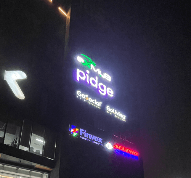
When I joined EMB Global in 2021, the brand was still called ExMyB a name that no one could pronounce correctly.®
Some said “BeMyEx,” others called it “XMB” or even “XXMB.” The name just didn’t land well, and the logo wasn’t helping either. It used all lowercase letters and awkwardly forced an eagle into the “x,” which made the whole design feel off. On top of that, there was no clear brand story, no mission or vision, and no design system in place. That’s when I stepped in and took on the responsibility of shaping the entire brand identity from the ground up.
First Brand Revamp
From the very beginning, I played a key role in building and evolving the brand identity. I worked closely with the founders to understand what they truly wanted the brand to stand for and how they wanted it to be perceived.
I recommended we move away from the name "ExMyB" and instead use Expand My Business in full to ensure clarity and credibility. I designed a new logo that allowed the eagle symbol to shine while giving it a balanced and modern look. I also drafted our first set of mission, vision, and values, and designed office wall graphics to reinforce the brand internally. This marked the first major turning point in how we looked, spoke, and presented ourselves as a company.
Second Brand Revamp
Fast forward to 2024, our focus shifted. The company was growing rapidly and had its eyes set on the international market, especially the US. We also started working with large Indian enterprises, which meant our old brand look felt too local and commercial.
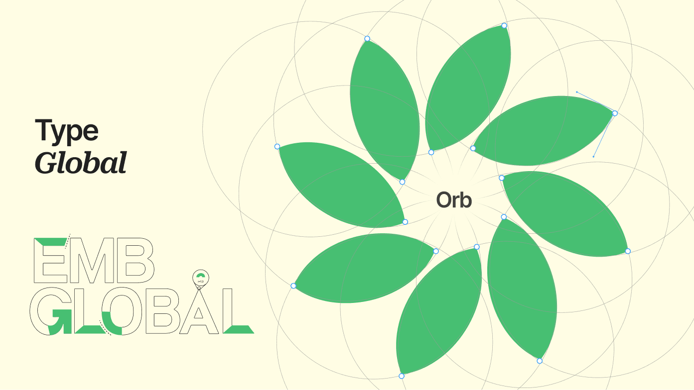
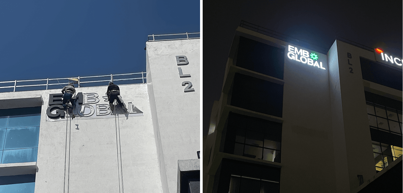
It lacked the premiumness and global touch we now needed. So we decided to evolve again and I led this revamp too. This time, we shortened the name to EMB Global, which felt sharper and more scalable. I introduced the concept of the ORB a graphic element that symbolizes balance, symmetry, and global reach. We switched from Poppins to Inter as our main font and upgraded our color palette for a more premium feel. I created a full brand guidelines document that captured all these changes and ensured consistency across every platform.
In both versions of the rebrand, I was responsible for creating a wide range of visual assets from logo design, brand decks, internal documents, to office wall graphics, email signatures, presentation templates, and more. Everything was built with scalability and adaptability in mind. I also helped ensure the brand looked unified across marketing, sales, design, and product teams.
Impact & Outcomes
The rebranding not only solved the confusion around our name and look it gave us a powerful, scalable identity that worked across global markets.
It elevated how clients, investors, and even employees saw us. The updated branding helped us gain more traction with international prospects and align our internal teams with a clear set of values and a shared visual language. From being a growing startup with a clunky name, EMB Global became a brand that stood for clarity, confidence, and international ambition and I’m proud to have been at the heart of that transformation.
More Works
©2024

DISHA Cell by Indian Air Force
iaf-client
Project
Digital Marketing
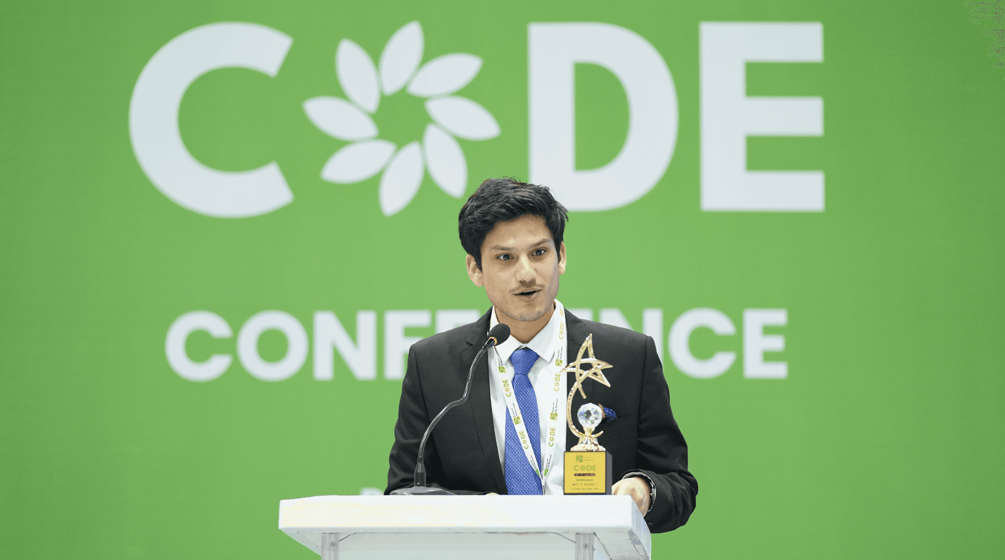
CODE 2023: An event by EMB Global
code-newdelhi
Project
Event & Brand Marketing
State of Technology 2024
emb-ebook
Project
Design

Brand work showcase
emb-clientele
Project
Design
Social Media Management
emb-social-media
Project
Social Media Management
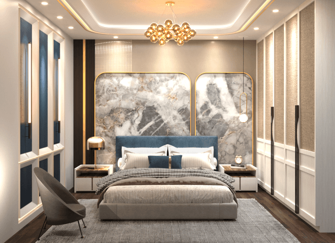
3D Architectural Renders
architectural-render
Project
Modeling & Rendering
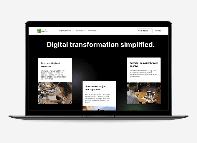
UI/UX Design for EMB Global Website
emb-websites
Project
UI/UX & Development
Pitch Decks
emb-pitchdeck
Project
Design
2021, 2024
EMB Brand Identity Revamp
This project traces the journey of our brand from ExMyB, a name people struggled to pronounce, to Expand My Business, which brought clarity and professionalism, and finally to EMB Global, a bold identity built for international markets and enterprise trust.
Project
Branding
Overview
When I joined EMB Global in 2021, the brand was still called ExMyB a name that no one could pronounce correctly.®
Some said “BeMyEx,” others called it “XMB” or even “XXMB.” The name just didn’t land well, and the logo wasn’t helping either. It used all lowercase letters and awkwardly forced an eagle into the “x,” which made the whole design feel off. On top of that, there was no clear brand story, no mission or vision, and no design system in place. That’s when I stepped in and took on the responsibility of shaping the entire brand identity from the ground up.
First Brand Revamp
From the very beginning, I played a key role in building and evolving the brand identity. I worked closely with the founders to understand what they truly wanted the brand to stand for and how they wanted it to be perceived.
I recommended we move away from the name "ExMyB" and instead use Expand My Business in full to ensure clarity and credibility. I designed a new logo that allowed the eagle symbol to shine while giving it a balanced and modern look. I also drafted our first set of mission, vision, and values, and designed office wall graphics to reinforce the brand internally. This marked the first major turning point in how we looked, spoke, and presented ourselves as a company.
Second Brand Revamp
Fast forward to 2024, our focus shifted. The company was growing rapidly and had its eyes set on the international market, especially the US. We also started working with large Indian enterprises, which meant our old brand look felt too local and commercial.
It lacked the premiumness and global touch we now needed. So we decided to evolve again and I led this revamp too. This time, we shortened the name to EMB Global, which felt sharper and more scalable. I introduced the concept of the ORB a graphic element that symbolizes balance, symmetry, and global reach. We switched from Poppins to Inter as our main font and upgraded our color palette for a more premium feel. I created a full brand guidelines document that captured all these changes and ensured consistency across every platform.
In both versions of the rebrand, I was responsible for creating a wide range of visual assets from logo design, brand decks, internal documents, to office wall graphics, email signatures, presentation templates, and more. Everything was built with scalability and adaptability in mind. I also helped ensure the brand looked unified across marketing, sales, design, and product teams.
Impact & Outcomes
The rebranding not only solved the confusion around our name and look it gave us a powerful, scalable identity that worked across global markets.
It elevated how clients, investors, and even employees saw us. The updated branding helped us gain more traction with international prospects and align our internal teams with a clear set of values and a shared visual language. From being a growing startup with a clunky name, EMB Global became a brand that stood for clarity, confidence, and international ambition and I’m proud to have been at the heart of that transformation.
More Works
©2024
DISHA Cell by Indian Air Force
iaf-client
Project
Digital Marketing
CODE 2023: An event by EMB Global
code-newdelhi
Project
Event & Brand Marketing
State of Technology 2024
emb-ebook
Project
Design
Brand work showcase
emb-clientele
Project
Design
Social Media Management
emb-social-media
Project
Social Media Management
3D Architectural Renders
architectural-render
Project
Modeling & Rendering
UI/UX Design for EMB Global Website
emb-websites
Project
UI/UX & Development
Pitch Decks
emb-pitchdeck
Project
Design
2021, 2024
EMB Brand Identity Revamp
This project traces the journey of our brand from ExMyB, a name people struggled to pronounce, to Expand My Business, which brought clarity and professionalism, and finally to EMB Global, a bold identity built for international markets and enterprise trust.
Project
Branding
Overview
When I joined EMB Global in 2021, the brand was still called ExMyB a name that no one could pronounce correctly.®
Some said “BeMyEx,” others called it “XMB” or even “XXMB.” The name just didn’t land well, and the logo wasn’t helping either. It used all lowercase letters and awkwardly forced an eagle into the “x,” which made the whole design feel off. On top of that, there was no clear brand story, no mission or vision, and no design system in place. That’s when I stepped in and took on the responsibility of shaping the entire brand identity from the ground up.
First Brand Revamp
From the very beginning, I played a key role in building and evolving the brand identity. I worked closely with the founders to understand what they truly wanted the brand to stand for and how they wanted it to be perceived.
I recommended we move away from the name "ExMyB" and instead use Expand My Business in full to ensure clarity and credibility. I designed a new logo that allowed the eagle symbol to shine while giving it a balanced and modern look. I also drafted our first set of mission, vision, and values, and designed office wall graphics to reinforce the brand internally. This marked the first major turning point in how we looked, spoke, and presented ourselves as a company.
Second Brand Revamp
Fast forward to 2024, our focus shifted. The company was growing rapidly and had its eyes set on the international market, especially the US. We also started working with large Indian enterprises, which meant our old brand look felt too local and commercial.
It lacked the premiumness and global touch we now needed. So we decided to evolve again and I led this revamp too. This time, we shortened the name to EMB Global, which felt sharper and more scalable. I introduced the concept of the ORB a graphic element that symbolizes balance, symmetry, and global reach. We switched from Poppins to Inter as our main font and upgraded our color palette for a more premium feel. I created a full brand guidelines document that captured all these changes and ensured consistency across every platform.
In both versions of the rebrand, I was responsible for creating a wide range of visual assets from logo design, brand decks, internal documents, to office wall graphics, email signatures, presentation templates, and more. Everything was built with scalability and adaptability in mind. I also helped ensure the brand looked unified across marketing, sales, design, and product teams.
Impact & Outcomes
The rebranding not only solved the confusion around our name and look it gave us a powerful, scalable identity that worked across global markets.
It elevated how clients, investors, and even employees saw us. The updated branding helped us gain more traction with international prospects and align our internal teams with a clear set of values and a shared visual language. From being a growing startup with a clunky name, EMB Global became a brand that stood for clarity, confidence, and international ambition and I’m proud to have been at the heart of that transformation.
More Works
©2024
DISHA Cell by Indian Air Force
iaf-client
Project
CODE 2023: An event by EMB Global
code-newdelhi
Project
State of Technology 2024
emb-ebook
Project
Brand work showcase
emb-clientele
Project
Social Media Management
emb-social-media
Project
3D Architectural Renders
architectural-render
Project
UI/UX Design for EMB Global Website
emb-websites
Project
Pitch Decks
emb-pitchdeck
Project