Apr 1, 2024
The Power of Less: Why Minimalism in Design Speaks Louder
I believe great design isn’t always the loudest in the room - it’s the one that lingers. It’s the feeling you get when everything just clicks.
Design
The Power of Less
In a world filled with information overload and sensory chaos, design has become not just about aesthetics but about clarity and impact.
And that’s where minimalism steps in—not just as a design trend but as a philosophy that prioritizes function, clarity, and emotional resonance.
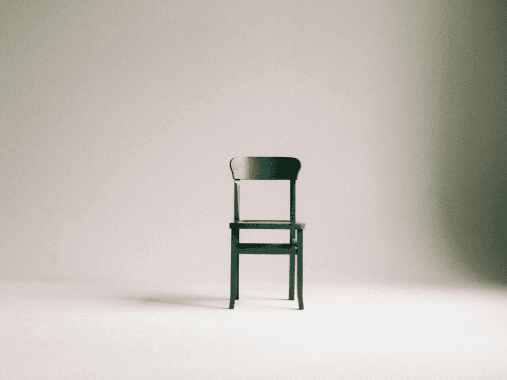
Minimalism is not about removing things just for the sake of it. It’s about stripping away what doesn’t matter so that what does can shine through. It's design that doesn't scream for attention—but gets it anyway.
The Core Principle: Clarity in Communication
At the heart of minimal design lies a commitment to clarity. Every visual element is intentional. Every space, every font choice, every color—it all exists to support the core message.
When I think about effective communication through design, I think of work that doesn’t just speak to you—it makes you feel understood. Good design should never need an explanation. It should feel intuitive.
Whether it's a brand message, a product interaction, or a billboard on the highway, the goal remains the same: the user should get it instantly. If you have to explain it, it’s probably not working.
Evolution
Evolution
Visual Evolution: From Clutter to Clarity
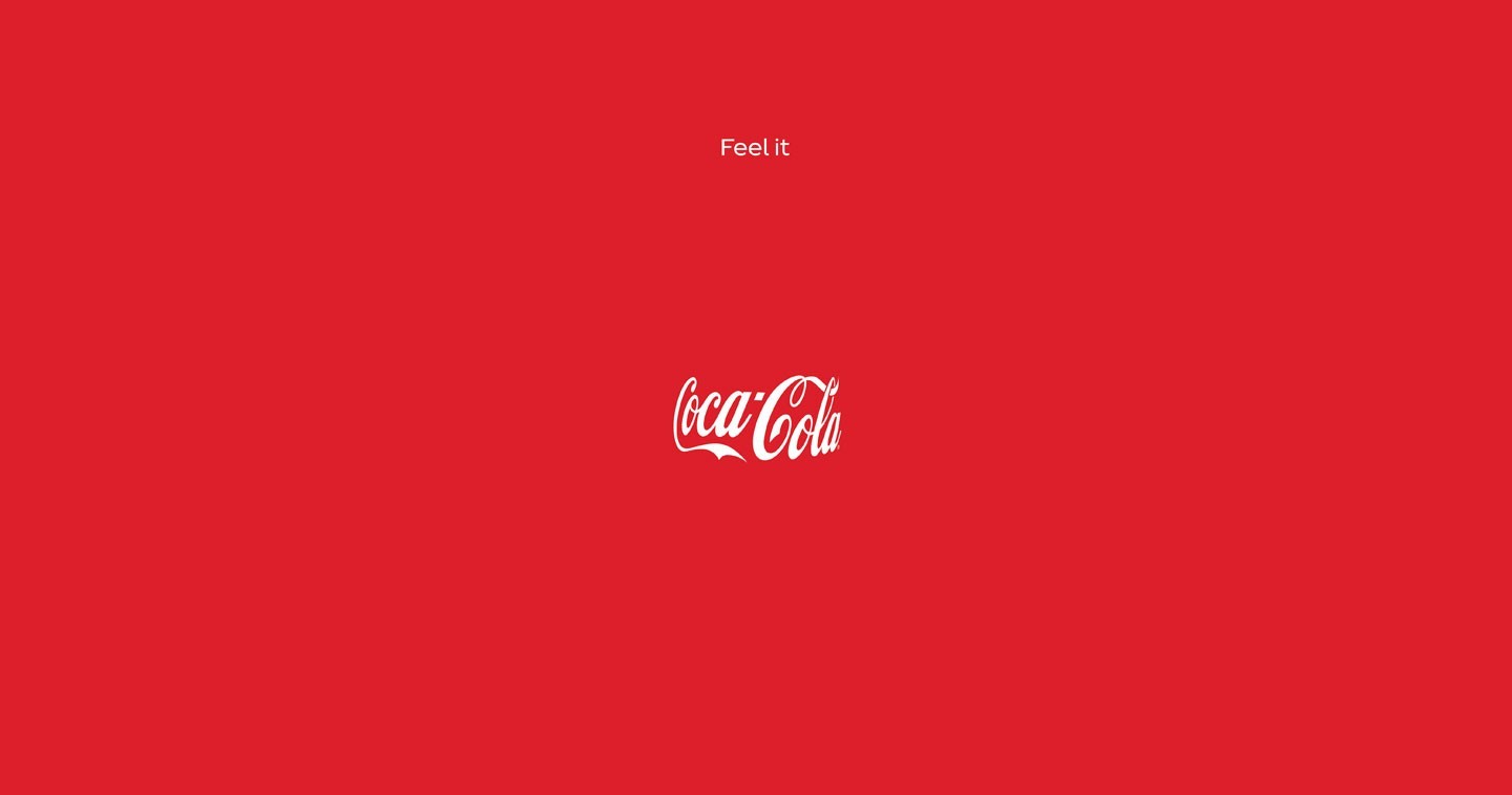
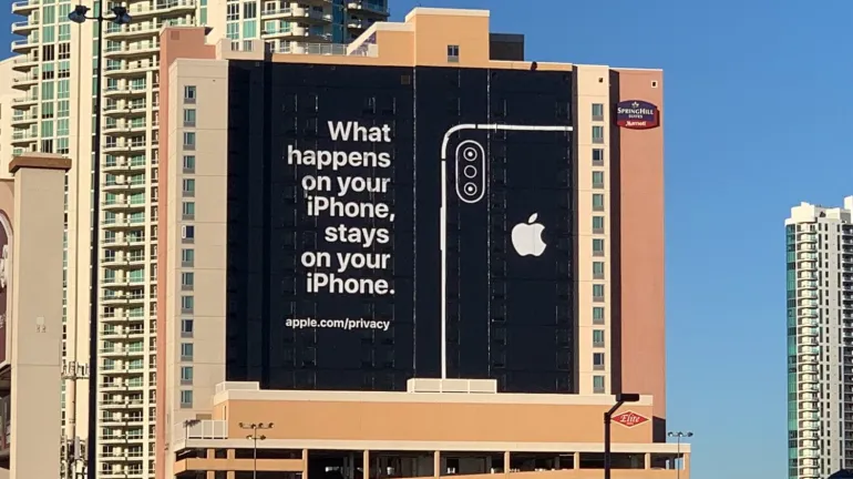
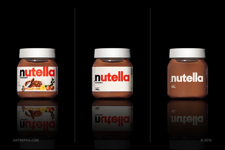
Over the past two decades, we’ve seen a visible shift in how brands present themselves. Earlier, maximalism had its moment—big graphics, louder colors, and layered textures. But gradually, brands started realizing that simplicity often builds more trust. Think of Apple. Think of Airbnb. Even legacy brands have moved towards stripped-down logos, fewer words, and more breathing room.
This evolution wasn’t just aesthetic—it was strategic. In a mobile-first, attention-deficit era, the cleaner your message, the longer it stays. Minimalism has become a survival tactic in design.
Good Design Is Felt, Not Just Seen
I believe great design isn’t always the loudest in the room—it’s the one that lingers. It’s the feeling you get when everything just clicks.
Sometimes it’s an onboarding screen that tells you exactly what to do without overwhelming you. Sometimes it’s a landing page that feels inviting without being flashy. You don’t always see what’s working—but you feel it.
When people say "that just feels right," that’s usually good design doing its quiet work.
Function Over Ornamentation
One of the biggest misconceptions about minimalist design is that it’s easy. It’s not. It requires an even sharper eye for detail, hierarchy, and composition. There’s no fluff to hide behind. Every pixel counts. Every visual decision must have a reason.
It forces you to ask the hard questions: What’s the real message? What do we want users to feel? What’s non-essential here?
By focusing on these, you end up building experiences that are more than just beautiful—they’re useful.

Is it boring?
Is it boring?
Minimalism Isn’t Boring, It’s Honest
The most effective minimalist design doesn’t lack personality it radiates it through purposeful choices. A single color pop in a grayscale layout. A sharp typeface that speaks with confidence. A clean layout that respects your time.
Minimalism invites the user into a conversation, rather than shouting at them.
It’s not about aesthetic restraint - it’s about emotional precision.
Why I Work This Way
In my projects, whether it’s building a report, launching an event, or creating brand identities—I lean on minimalism as a tool to make things clearer, not colder. It’s a way of thinking, not just designing.
When I reduce, I’m not taking away I’m making space. For your message. For your audience. For real connection. Because in the end, good design shouldn’t be complicated. It should feel like the truth uncovered, unpolished, and completely you.
Latest Updates
©2024
Latest Updates
©2024

Apr 1, 2024
The Power of Less: Why Minimalism in Design Speaks Louder
I believe great design isn’t always the loudest in the room - it’s the one that lingers. It’s the feeling you get when everything just clicks.
Design
The Power of Less
In a world filled with information overload and sensory chaos, design has become not just about aesthetics but about clarity and impact.
And that’s where minimalism steps in—not just as a design trend but as a philosophy that prioritizes function, clarity, and emotional resonance.
Minimalism is not about removing things just for the sake of it. It’s about stripping away what doesn’t matter so that what does can shine through. It's design that doesn't scream for attention—but gets it anyway.
The Core Principle: Clarity in Communication
At the heart of minimal design lies a commitment to clarity. Every visual element is intentional. Every space, every font choice, every color—it all exists to support the core message.
When I think about effective communication through design, I think of work that doesn’t just speak to you—it makes you feel understood. Good design should never need an explanation. It should feel intuitive.
Whether it's a brand message, a product interaction, or a billboard on the highway, the goal remains the same: the user should get it instantly. If you have to explain it, it’s probably not working.
Evolution
Visual Evolution: From Clutter to Clarity
Over the past two decades, we’ve seen a visible shift in how brands present themselves. Earlier, maximalism had its moment—big graphics, louder colors, and layered textures. But gradually, brands started realizing that simplicity often builds more trust. Think of Apple. Think of Airbnb. Even legacy brands have moved towards stripped-down logos, fewer words, and more breathing room.
This evolution wasn’t just aesthetic—it was strategic. In a mobile-first, attention-deficit era, the cleaner your message, the longer it stays. Minimalism has become a survival tactic in design.
Good Design Is Felt, Not Just Seen
I believe great design isn’t always the loudest in the room—it’s the one that lingers. It’s the feeling you get when everything just clicks.
Sometimes it’s an onboarding screen that tells you exactly what to do without overwhelming you. Sometimes it’s a landing page that feels inviting without being flashy. You don’t always see what’s working—but you feel it.
When people say "that just feels right," that’s usually good design doing its quiet work.
Function Over Ornamentation
One of the biggest misconceptions about minimalist design is that it’s easy. It’s not. It requires an even sharper eye for detail, hierarchy, and composition. There’s no fluff to hide behind. Every pixel counts. Every visual decision must have a reason.
It forces you to ask the hard questions: What’s the real message? What do we want users to feel? What’s non-essential here?
By focusing on these, you end up building experiences that are more than just beautiful—they’re useful.
Is it boring?
Minimalism Isn’t Boring, It’s Honest
The most effective minimalist design doesn’t lack personality it radiates it through purposeful choices. A single color pop in a grayscale layout. A sharp typeface that speaks with confidence. A clean layout that respects your time.
Minimalism invites the user into a conversation, rather than shouting at them.
It’s not about aesthetic restraint - it’s about emotional precision.
Why I Work This Way
In my projects, whether it’s building a report, launching an event, or creating brand identities—I lean on minimalism as a tool to make things clearer, not colder. It’s a way of thinking, not just designing.
When I reduce, I’m not taking away I’m making space. For your message. For your audience. For real connection. Because in the end, good design shouldn’t be complicated. It should feel like the truth uncovered, unpolished, and completely you.